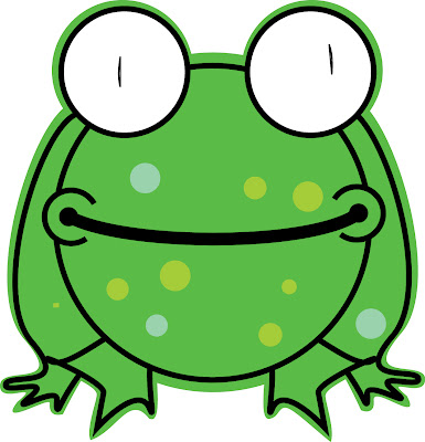
 and here is my final, remote.
Thursday, December 11, 2008
Thursday, December 4, 2008
FInal Vector
 This is my final. I worked on it a lot and I can't really say i had inspiration from anything. I just tried what is best and I have a lot of variations of this. Some with a lot of paint spatter, different colors, anything. I ended thinking that it was overall too busy, so I just made the background smaller, and kept the white around it. I think it opens it up more, but i dont want people to think its so the rest of the picture can bleed out from it. Actually I don't know what i want people to think of it, but I like it.
Bellpeppa Update
 I'm kinda disappointed in this one because at first it was coming along really well and i was proud of it, but then i think I went a bit too crazy with the mesh and I just tried to pack to much detail into it and it overwhelmed me, and so its slightly unfinished. Slightly. But overall, I think it came out somewhat ok.
Flower Bouquet Update
Word Effects Update
Wednesday, December 3, 2008
Updated gig poster
Thursday, November 20, 2008
Face Vector Progress 1...

this is it thus far, me and my skinny arms. I still need to fix the certain shapes that makes up the lines of my face, some i like some i do not. One thing i really like is how my stubble comes across well in the little random, jagged shapes, but others i stll need to smooth out. Also, the colors are strangely desaturated, maybe i can find out how to fix that later.
TEXT HEAVY DOC.

this is my document so far. I am pretty disappointed with it and I am definitely going to try and upgrade it later. Honestly i cannot stand InDesign, and my frustrations with it come out in this document. I really need to strengthen it somehow and i think that will come through when i put more thought into it.
Thursday, November 13, 2008
Thursday, October 30, 2008
Thursday, October 23, 2008
Tuesday, September 30, 2008
Bellpeppa


...aaaand this is what I have so far of the pepper. I've really only worked on the very front of it, and its a lot harder then i first thought, but its a lot of fun. So far this is the most interesting part of class. At first i hated the mesh, and i still kind of do to be honest, but it is getting easier to control. Those bright reflecting areas are extremely hard for me now, they still look funky but like I said, this isn't really complete.
The Pod

This is what i have so far for my Bean Pod. It is taking me longer than usual because instead of making each pod separate, I did the first and last pod attached with the stem, so that makes it a little but more difficult. Also the curve of the pods themselves makes them difficult to fill correctly. But, this is it so far. I should also say that for some reason, the colors aren't exactly correct in the jpeg. Maybe it is because I compressed it too much for web...
The Chip
So far this is the project that I'm most behind. I still need to add everything to it to make it look somewhat interesting. I think it's just I find the other things so much more interesting than shapes.
Monday, September 29, 2008
the cat

well this is my first project, on here. i actually finished this a while ago, but yea. The whole concept just reminded me of a neon-glowing club sign. I hope to maybe update the 9 sometime, maybe adding something to the nose. I purposefully offset the eyes somewhat, I think it gives it a goofy kinda thing to it. ...
..but there it is!
Thursday, August 28, 2008
Subscribe to:
Comments (Atom)


